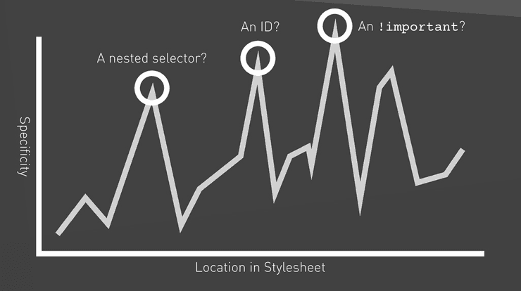
Everyone knows how CSS can be painful when not written properly. It is not an expressive language, it has a global scope, cascading rules (the source order really matters), inheritance, and selector specificity wars. The way CSS works makes it easy for bad code to take over. It is possible to use nested selectors to override existing rules, use !important to quickly solve a styling problem, write CSS to undo other CSS, and so on.
If you want to know more about how CSS works, read this.
These issues are especially recurring on large projects with lots of developers involved. If we do not understand their impact, our tendency goes toward generating a giant snow ball that nobody wants to touch or refactor.
But how to solve these issues elegantly, be it in large or smaller projects, and using our tools to our advantage? The answer is by writing CSS in specificity order, and that’s where ITCSS comes to help!
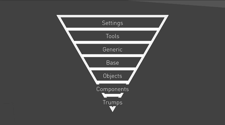
ITCSS (Inverted Triangle CSS)
ITCSS is an architecture especially suited for large code bases created by Harry Roberts for large CSS code bases, It is neither a library nor a framework, but a way of thinking. Moreover, it doesn’t really depend on pre-processors such as SASS or LESS. Which means we can apply it with either pure CSS or any pre-processor of our liking. We can also glean the benefits of ITCSS on smaller code bases.
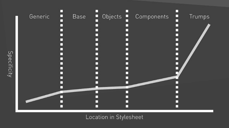
It consists in organizing CSS files within layers, from generic to explicit, and from low to high specificity. These layers tame the source order and manage cascading stylesheets in a more sane way.
Layers, in turn, are composed of sections, each defining a particular specificity and meaning. This is ITCSS’ way to gracefully deal with specificity wars: there is no redundancy, and specificity grows linearly.
With that being said, every concept has a determined place to live in, and this is one of the things I like the most about ITCSS. When all sections are well-defined and perfectly understood, it becomes obvious where to put new files or how to look up for existing code, thus avoiding questions like:
- "Where do I put this style? Should I create a new file or just put it into an existing one?"
- "Where did I put that class I wrote last week?"
Now, let’s go over each of these sections.
Settings
Settings refer to all your global configurations and variables, like sizes, colors, and fonts. They should be used to aid in your build configuration, and therefore should not contain actual CSS code. Example:
$color-ui: #bada55;
$spacing-unit: 10px;
Tools
If you use a pre-processor in your build setup, this is the place where mixins and functions ought to live. For example: mixins for media queries, font-faces, animations, etc.
@mixin font-brand() {
  font-family: "UI Font", sans-serif;
  font-weight: 400;
}
If you do not use a pre-processor, you can safely ignore these first two layers.
Generic
Here you should have low-specificity styles which are meant to be applied all over the DOM. These include box-sizing, resets, normalize, etc.
This is the first layer where we can use pure CSS.
*,
*::before,
*::after {
  box-sizing: border-box;
}
Personally, I enjoy having in this section styles such as text selection, font-smoothing and tap-highlight reset.
Elements
Elements refer to all unclassed HTML tags. Styles in here get applied to specific HTML tags, like headings, links, and lists. This is the last layer where we use type selectors.
ul {
  list-style: square outside;
}
Although this layer is sometimes called "base", I prefer to name it elements, due to it being a more readable name.
Objects
Objects follow OOCSS (Object Oriented CSS) principles. They are small and reusable pieces with no aesthetics which can be used in UI composition. Examples are wrappers, grids, skins to apply to lists, buttons, inputs, etc. In other words: any pattern that is repeated over your UI is a potential object candidate. What ITCSS author said applies to this layer: No cosmetics. Agnostically named (e.g. .ui-list).
Here we start using just CSS classes:
.ui-list {
  margin: 0;
  padding: 0;
  list-style: none;
}

.ui-list__item {
  padding: $spacing-unit;
}
I find objects to be the most confusing layer due to it mixing objects and components. If you do not use OOCSS or find it confusing, just skip this layer. I personally prefer to skip it entirely to avoid confused mental mapping. That avoids me to stop and think: “Is that an object or a component?", and to remain focused on the real problem.
This is yet another nice aspect of ITCSS: you can change and adapt anything to your specific needs.
Components
In this layer, like the author said, you should have well-designed pieces of UI that can be reused in more than one spot (or be applied to just one spot). Also, classes must be named explicitly:
.products-list {
  @include font-brand();
  border-top: 1px solid $color-ui;
}

.products-list__item {
  border-bottom: 1px solid $color-ui;
}
So, there’s a basic difference between objects and components. The former refers to generic, abstract pieces of UI with no aesthetic, whereas the latter is a more specific layer targeted at reusability and well-defined aesthetics.
If you choose not to use the objects layer, you can use components to handle all small, independent, generic, and reusable pieces of your UI, like .button, .input, etc.
If you need to style even more specific parts of your UI, you can add a new layer called pages or layout, depending on the specificity of your styles and the pattern adopted by your team.
Trumps
Here you can have overrides, helpers, utilities, and specific classes that affect single pieces of the DOM, like, .hidden, .relative, .one-half, etc.
Because we need to override settings coming from other layers, this is the only place where !important is permitted.
.one-half {
  width: 50% !important;
}
However, be careful and don’t let this layer grow out of bounds! Try to add coherent classes to it, and avoid overriding styles with !important just for the sake of it.
Extra
Because ITCSS is very adaptable and customizable, you can add and remove layers as you wish or need to scale. For example, you can add a theme layer between components and trumps if you need specific theming.
Concluding
With ITCSS, specificity slowly increases and can be customized according to specific needs. Therefore, it allows your CSS to scale much more easily. If you found this idea attractive and want to stick to it, I recommend you define a concise pattern with your team and be rigid with it. Benefits are that you will finally have all of your code in predictable spots, thus bumping up everyone’s productivity!
References
This post was based on Harry Roberts presentation, with my own thoughts added. Take a look at it if you want to go a little further.
Thank you.


